How Intuitive UX Design Keeps Visitors Engaged
Discover how intuitive UX design can dramatically reduce your website's bounce rate and transform casual visitors into engaged prospects.
 Enri Zhulati
Your Visitors Are Leaving. Here's Why UX Is the Fix.
People land on your site and vanish. No clicks, no scrolls, nothing. You check analytics and see a bounce rate that makes you wince. I've seen this pattern hundreds of times over the past decade building digital products.
The problem is almost never your traffic. It's almost always the experience you're delivering once someone arrives.
In 2026, visitors are more informed and more impatient than ever. AI-driven search means people show up with higher intent but lower tolerance for friction. Engagement rates across the web dropped 10% year-over-year according to Contentsquare's latest benchmarks. Visitors are consuming less, but expecting more.
If your site can't prove its value in the first two seconds, you've already lost.
Bounce Rate Is a Trust Metric
Bounce rate measures the percentage of visitors who land on a page and leave without doing anything. No second page. No form fill. No click. Just gone.
Here's where most sites fall:
- Under 40% - You're doing well. Visitors are engaged.
- 40-55% - Average. Room for improvement.
- 55-70% - Something is off. Time to investigate.
- Above 70% - Your site is actively pushing people away.
But the number alone doesn't tell the full story. A blog post with an 80% bounce rate might be fine if people read the whole thing and got what they needed. A product page with a 60% bounce rate is a revenue leak.
Context matters. What matters more is understanding why people are leaving and fixing the experience that's driving them out.
The Real Cost of Bad UX
Every bounced visitor is money you already spent to acquire. If you're running paid ads to a page with a 70% bounce rate, you're burning 70 cents of every dollar. That math gets ugly fast.
But the damage goes deeper than wasted ad spend:
- Lost compounding value. A visitor who stays becomes a lead. A lead becomes a customer. A customer refers others. One bounce kills that entire chain.
- Search rankings take a hit. Google tracks engagement signals. Pages where users consistently bounce signal low quality, which pushes you down in results.
- Your brand takes the hit silently. People don't complain about bad experiences on small business sites. They just leave and never come back. You never hear about it.
The average website converts just 2.35% of visitors. Top performers hit 5x that. The difference isn't better products or bigger budgets. It's better UX.
Speed Is the Foundation of Everything
Nothing else matters if your site is slow. Full stop.
The data in 2026 is unforgiving. When load time goes from 1 second to 3 seconds, bounce probability increases 32%. Push that to 5 seconds and it jumps 90%. At 10 seconds, you've lost virtually everyone.
47% of users expect your site to load in under 2 seconds. 53% of mobile visitors abandon anything over 3 seconds. And 82% of consumers say slow speeds directly impact their purchasing decisions.
Here's what I do on every project before touching anything else:
- Serve images in next-gen formats. AVIF and WebP cut file sizes by 30-50% with no visible quality loss.
- Lazy load everything below the fold. Only load what the visitor can actually see.
- Hit your Core Web Vitals. Largest Contentful Paint under 2.5 seconds is the benchmark. Only 67% of sites hit it in 2025. Be in that group.
- Use a CDN. Serve assets from the closest server to each visitor. This alone can cut load times by 40-60%.
- Audit your scripts. Third-party trackers, chat widgets, and analytics tags pile up. Each one adds weight. Cut what you're not actively using.
I worked with an e-commerce client who was sitting at a 6-second load time. We stripped it down to 2.4 seconds. Their bounce rate dropped from 58% to 39%, and conversions climbed 22%. Speed wasn't part of the strategy. Speed was the strategy.
Navigation Should Be Invisible
The best navigation is the kind nobody notices. When someone has to think about where to click next, you've already created friction.
Research consistently shows that sites with clear navigation and logical flow see 10-15% lower bounce rates. That's not a rounding error. On 100,000 monthly visitors, that's 10,000 to 15,000 more people engaging with your content.
Principles I follow on every build:
- Five to seven main nav items, max. More than that creates decision paralysis. If you can't narrow it down, your site architecture needs rethinking.
- Labels should be obvious. "Solutions" is vague. "Services" is clear. "Empowerment Hub" is nonsense. Use the words your visitors would use.
- Every page needs a clear next step. Don't make visitors figure out what to do after reading. Tell them. Link them. Guide them forward.
- Search must work. If someone uses your search bar and gets zero results or irrelevant ones, they're gone.
I rebuilt a professional services site that had 12 top-level nav items. We consolidated to 5 with smart dropdowns. Session duration nearly doubled and bounce rate fell from 72% to 44%.
Design for Scanners, Not Readers
People don't read websites. They scan. Eye-tracking studies have confirmed this for over a decade and it's more true now than ever.
Your job is to make scanning productive. When visitors can quickly identify what's relevant to them, they engage. When they hit a wall of text, they bounce.
- Headlines do the heavy lifting. Someone should understand your page's value from the H2s alone, without reading a single paragraph.
- White space is a feature. Cramming more content into a layout doesn't communicate more. It communicates chaos. Give elements room to breathe.
- Visual hierarchy directs attention. Size, color, contrast, and position tell visitors what matters most. Use them intentionally.
- Short paragraphs only. Two to three sentences max. Long blocks of text signal "this will take effort" and effort is the enemy of engagement.
- Use formatting as a tool. Bold key phrases. Use bullet lists for anything with three or more items. Break up sections with relevant images or data.
Sites with clear visual hierarchy see 40% higher task completion rates. That means people actually find what they came for and do what you want them to do.
Mobile Isn't a Version. It's the Default.
Mobile bounce rates run 10-15% higher than desktop. That's not because mobile users are less interested. It's because most mobile experiences are still afterthoughts.
In 2026, mobile-first isn't a philosophy. It's math. The majority of your traffic is on a phone. If your site feels cramped, loads slowly, or has buttons too small to tap, you're losing your largest audience.
- Touch targets need to be 44x44 pixels minimum. Anything smaller causes mis-taps and frustration.
- Forms must be mobile-native. Show the right keyboard for each field. Minimize required fields. Use auto-fill where possible.
- Test on real devices. Responsive design tools in your browser are not enough. How your site feels in-hand matters.
- Personalization works. Dynamic, personalized mobile pages convert 25% better than static ones. Even simple location-based or behavior-based adjustments make a difference.
I redesigned a local service business's site with a mobile-first approach. Their mobile bounce rate went from 76% to 48%. Mobile leads increased by over 60%. That's the gap between "responsive" and "mobile-first."
Content Has to Earn Attention Immediately
Design gets people in the door. Content convinces them to stay.
The first thing a visitor sees above the fold needs to answer one question: "Am I in the right place?" If the answer isn't obvious within 2 seconds, they're gone.
- Lead with the outcome, not the process. "We build custom software" is about you. "Ship your product 3x faster" is about them.
- Social proof belongs above the fold. Logos, ratings, testimonial snippets. Anything that says "other people trust this" reduces friction immediately.
- Match your content to the traffic source. If someone clicks a Google ad about "affordable web design," they better land on a page about affordable web design. Not your homepage. Not your about page.
- Interactive elements outperform static ones. Interactive forms convert at 47.3% compared to 2.8% for static forms. Calculators, quizzes, and configurators keep people engaged because participation creates investment.
A well-designed landing page can increase conversions by up to 400%. That's not a typo. The gap between a mediocre page and a great one is enormous.
Measure What Matters, Then Iterate
Bounce rate alone isn't enough. In 2026, smarter metrics give you a clearer picture of what's actually happening on your site.
- Engagement rate (GA4's replacement for bounce rate) measures sessions that last longer than 10 seconds, have a conversion event, or include 2+ page views.
- Scroll depth tells you if people are actually consuming your content or just loading the page and leaving.
- Task completion rate measures whether visitors accomplish what they came to do.
- Frustration signals like rage clicks, dead clicks, and excessive scrolling show exactly where your UX is breaking down.
Tools like Hotjar, FullStory, and Microsoft Clarity give you session recordings and heatmaps that show real behavior. Google's PageSpeed Insights handles the performance side. Use them together.
Then test. A/B test one thing at a time. Start with your highest-traffic, highest-bounce pages. Document what works. Roll it out across similar pages. Repeat.
Every 1% improvement in bounce rate compounds. More engaged visitors means more conversions. More conversions means more revenue. More revenue means you can invest more in the experience. It's a flywheel.
What I'd Do This Week
If your bounce rate is higher than you'd like, here's where I'd start:
- Run PageSpeed Insights on your top 5 pages. Fix anything in the red. Speed is the fastest win.
- Install a heatmap tool. Even the free tier of Microsoft Clarity will show you where people are clicking, scrolling, and dropping off.
- Simplify your navigation. If you have more than 7 items, cut or consolidate. Test it for two weeks.
- Rewrite your above-the-fold content. Lead with the visitor's problem and your solution. Cut everything that doesn't serve that purpose.
- Check your mobile experience on an actual phone. Tap every button. Fill out every form. Time the load. If anything frustrates you, it's frustrating your visitors 10x more.
These five steps won't take more than a few days. The impact shows up in weeks.
The Bottom Line
UX isn't decoration. It's the mechanism that turns traffic into revenue. Every design decision either reduces friction or adds it. Every second of load time either builds trust or erodes it.
The businesses winning online in 2026 aren't the ones with the biggest budgets. They're the ones who obsess over the experience. They test, they measure, they iterate. And they treat every visitor's attention as something that has to be earned, not expected.
Your website is your hardest-working salesperson. Make sure it's not driving people away at the door.
If you want a second set of eyes on your site's UX and engagement, let's talk. I'll tell you what's working, what's not, and exactly what to fix first.
Continue Reading

How I Built This Website with AI
Discover how product management principles transform your personal website from a static resume into a powerful tool that attracts opportunities.

Creating Your Digital Growth Engine
Discover how to build a Digital Growth Engine that systematically attracts ideal customers instead of wasting resources on ineffective tactics.
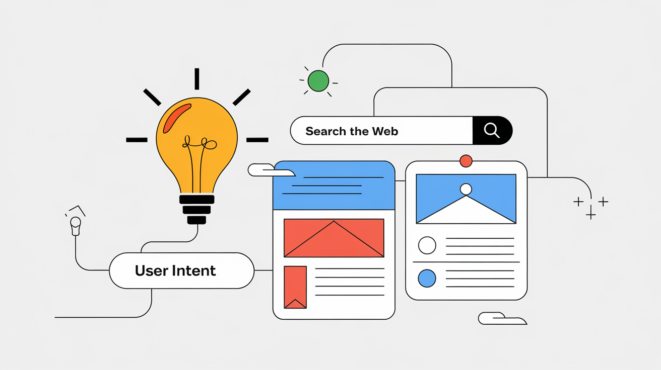
Understanding User Intent to Boost Rankings
While most SEO strategies focus on algorithms and technical factors, understanding the psychology behind searches is what truly drives exceptional rankings.